
Colonial Classics Brand Identity
Client:
Colonial ClassicsAbout the project:
With this update, I had a mission to bring a bit of the family’s roots back into this design. Colonial has a fascinating history dating back to 1958 where they opened the first Colonial Garden Center on the corner of Green River Road and Washington. But before then the family owned a seed company — J.A. McCarty Seed Company, which was one of the world’s largest processors of popcorn. One of Jacob’s (J.A.’s) fraternity friends at Purdue was Orville Redenbacher. Jacob’s entry into the popcorn industry inspired Redenbacher to begin building his popcorn empire. Pretty cool!
Lucky Jim’s Popcorn (produced by J.A. McCarty Seed Co) was a huge success, and its logo was shamrock. However, as corn blights hit, the company had to pivot and open a garden center. Since then they’ve been a local legacy brand. Everyone knows Colonial, and that Colonial = quality.
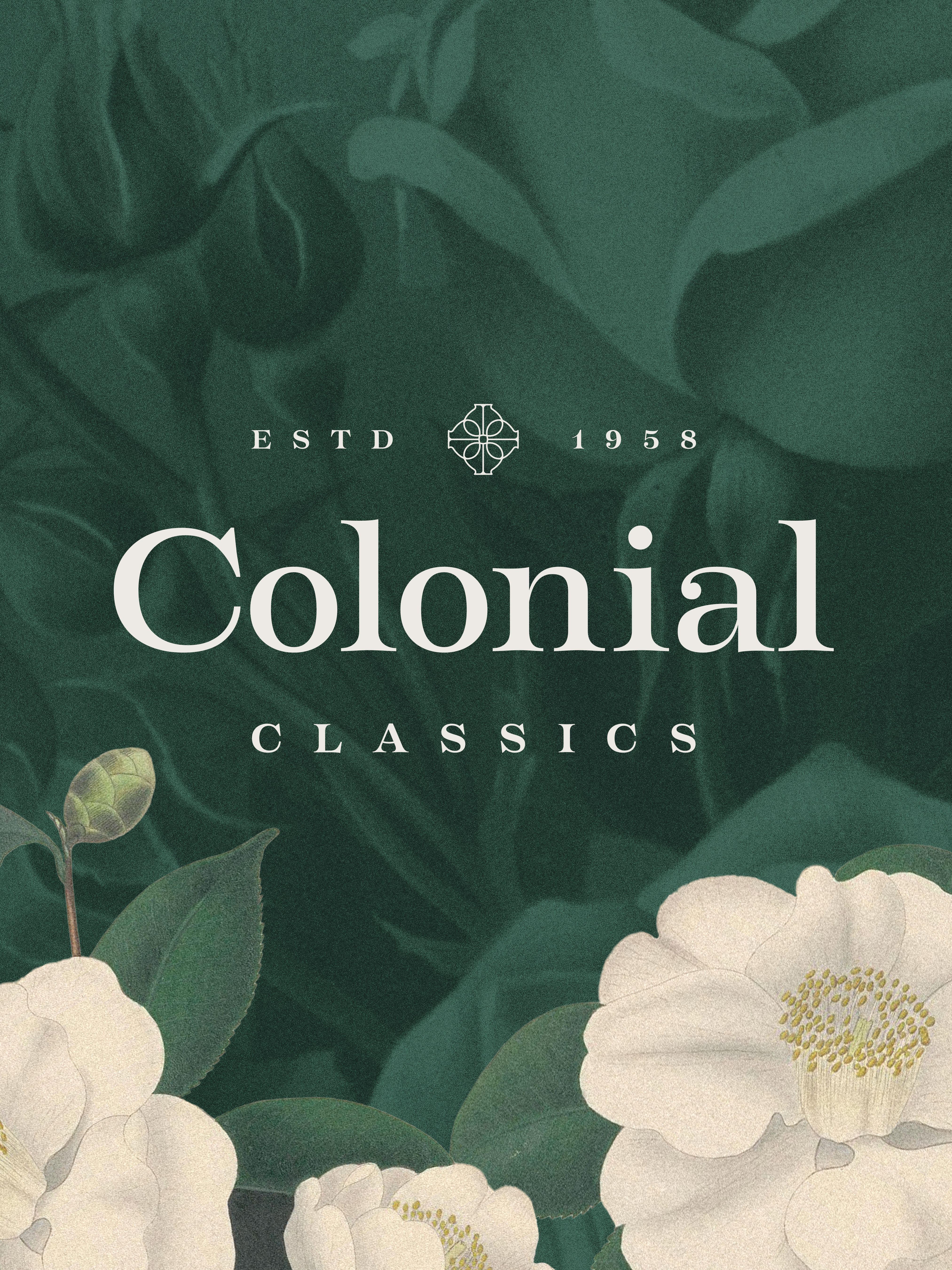
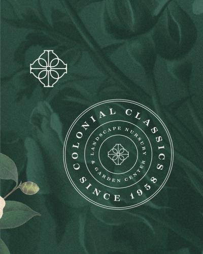
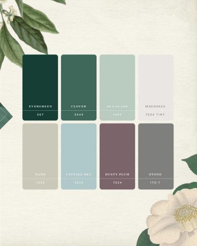
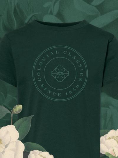
Because Colonial is synonymous with quality, I wanted to update their brand identity to match and infuse some of the family’s history. I added a mark to their logo, which is an inverted shamrock shape as a nod to Lucky Jim’s shamrock logo. It also creates an abstract flower shape which reads “landscaping”. I updated their typeface to remove papyrus from the logo and got their “C” on the same line. For their broader visual identity I worked in vintage flowers for a classic, regal feel.
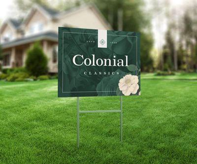
I also created custom vehicle wraps for Colonial The deep green is very easily recognizable from a distance.