
Haynie’s Corner Arts District Brand Identity
Client:
Haynie’s Corner Arts District AssociationAbout the project:
I get to design a brand for the best neighborhood in the world! This is our neighborhood, and we absolutely love it for its fun-loving people, progressive nature, eclectic atmosphere, and so much more. We enjoy the vibe of an arts district so much that when we go out of town, we seek out arts districts to stay in if we can.
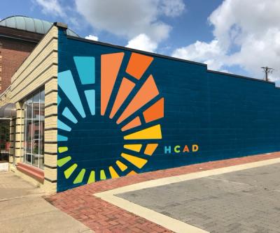
Haynie’s Corner had its own brand identity that was created several years back, but it needed an update. For the logo update, we decided to keep most of the overall concept. The fountain is considered the center of the arts district because that’s typically where most of the festival action is, and that’s where most of the restaurants and businesses are concentrated. From the fountain, there are rays that radiate out from the fountain in the sidewalk design. This is replicated in the logo, but the rays are also divided into segments, representing a mosaic. A mosaic represents both art (literally) and the neighborhood (figuratively). The colors represent each of the 4 neighborhoods that make up the Arts District – Goosetown, Blackford’s Grove, Culver, and Riverside neighborhoods.
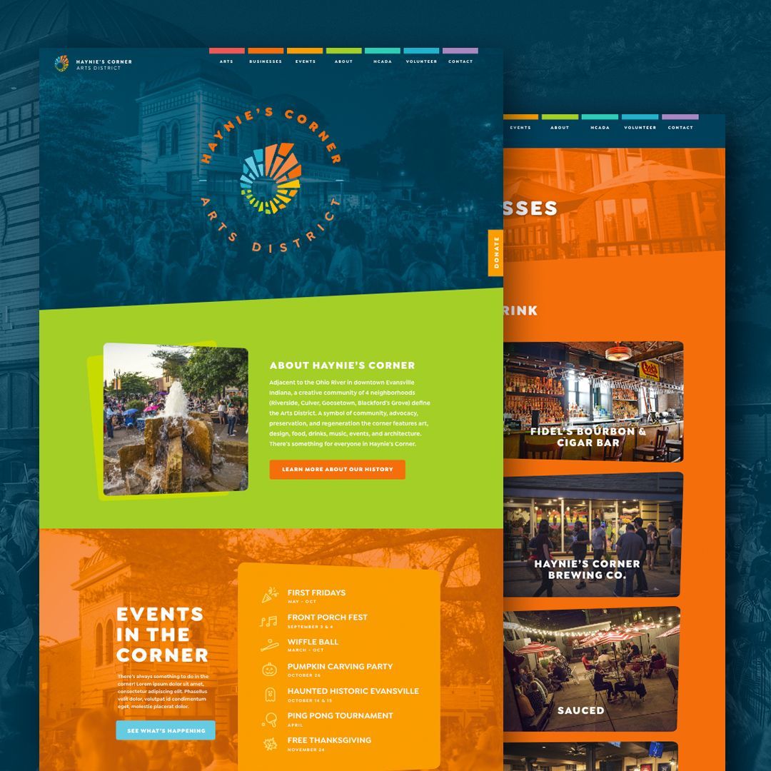
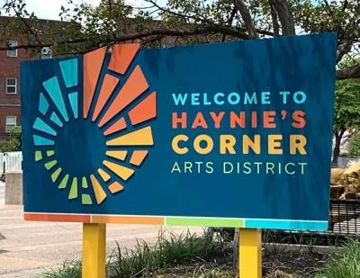
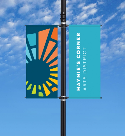
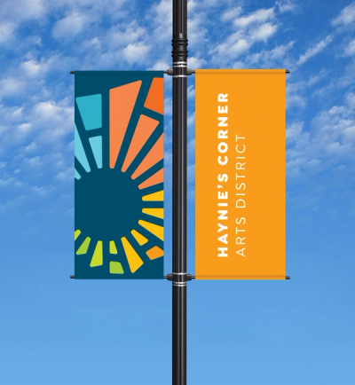
To expand the overall brand identity, we worked on a colorful new website design to help visitors find out about the events, businesses, and history of the corner. There’s a tent and table cloth that appears at every First Friday event in the summer months. We updated the signage with new pole banners and new “Welcome to Haynie’s Corner Arts District” Signage. A new mural design is in the works (currently in the preliminary dream stage, but we’re hoping to move into the execution phase eventually). Print collateral is also part of the brand identity, which includes rack cards for local tourism, annual appeals, and more.