
Lasting Order Organizing Brand Identity
Client:
Lasting Order OrganizingAbout the project:
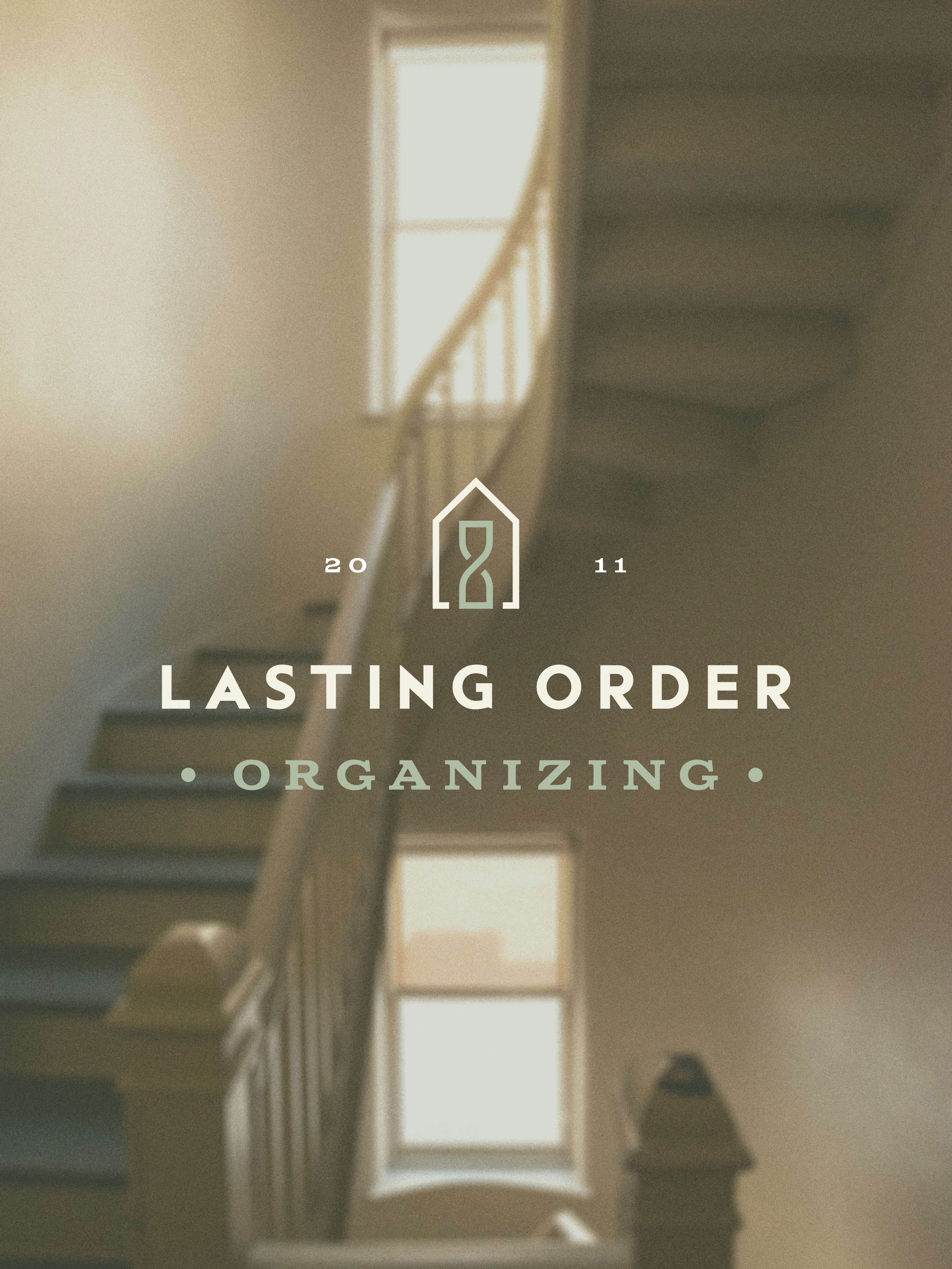
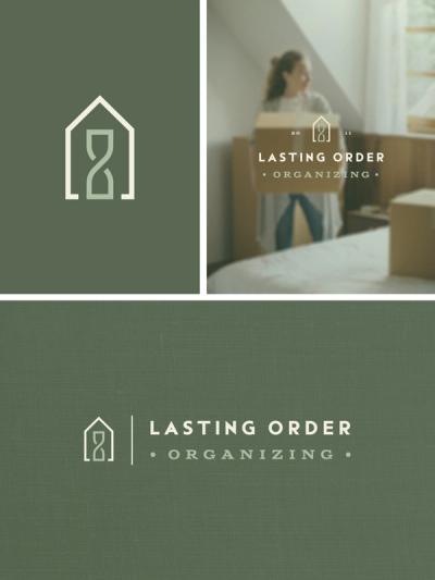
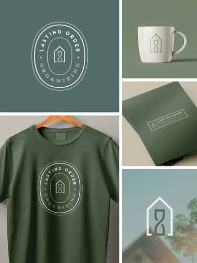
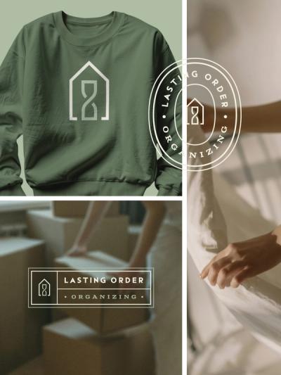
Since the goal of Lasting Order is to bring peace and calm to the home, the image of a house is a natural symbol for the logo mark. This mark also incorporates an hourglass as a window and door to symbolize saving time and lasting order. It also looks like an infinity symbol for a double meaning of “lasting”. The mark is simple, structured, iconic, yet still unique and memorable. The bold sans serif typeface gives an approachable look while providing optimal legibility. The seal lock-up in this logo suite is inspired by box labels for organizing.
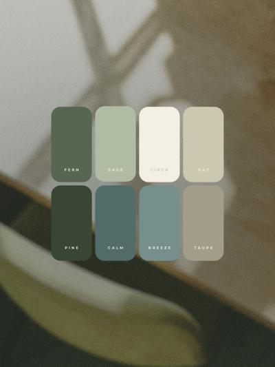
Since we aimed to evoke a sense of calm, approachable, professionalism, we also wanted the images and colors to do this. The soft greens and blues used are comforting colors connected to the earth, which naturally soothes.
Collaboration Credit